INITWIN · Editorial
Software & digital strategy
How we optimise the desktop of a software product
Information density, clarity, working speed and predictability in business applications
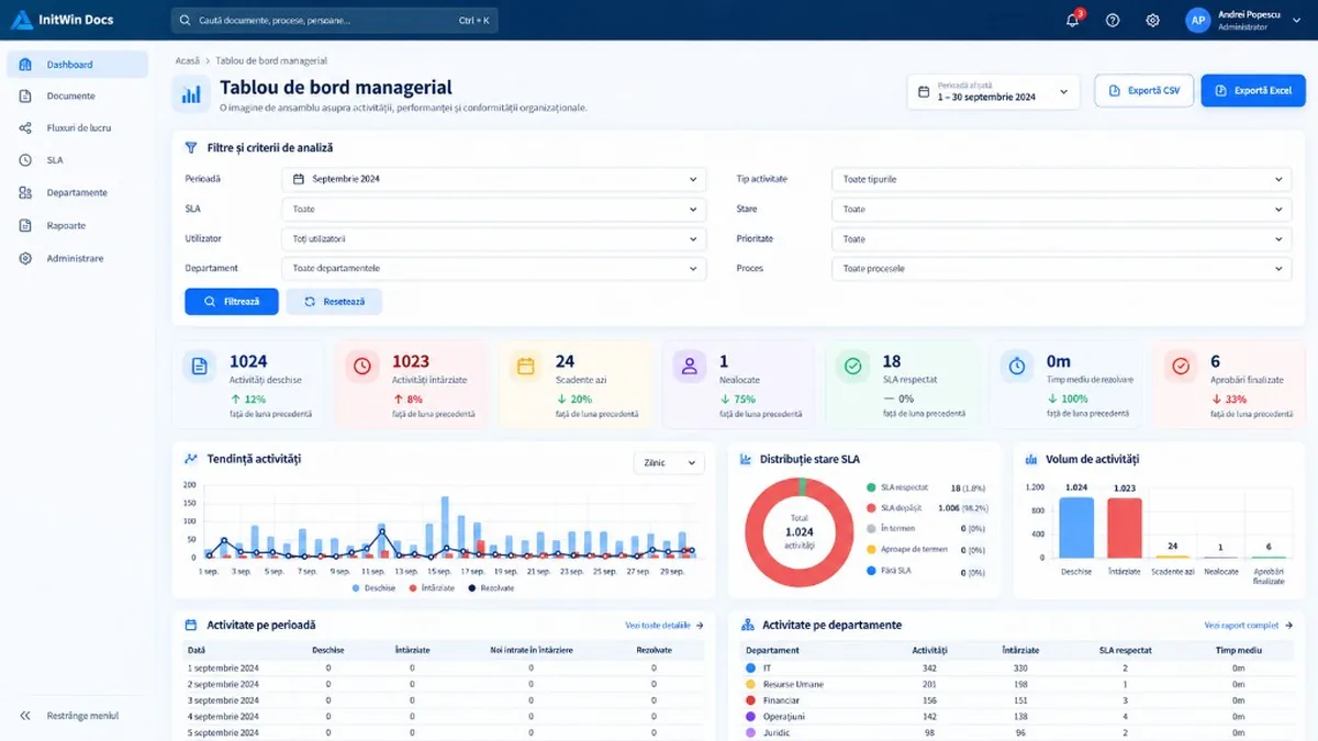
Information density, clarity and working speed — how we build an efficient desktop interface for business applications.
Optimising the desktop interface of a software product does not mean only “shrinking” elements or trying to pack as much information as possible onto a single screen. A well-optimised desktop must offer information density, clarity, working speed and predictability. The user must quickly understand what they see, immediately find the action they need, and be able to work for hours without a sense of clutter or visual fatigue.
In business applications this problem becomes even more important. A user working in a document management system, an ERP, CRM, DMS, ticketing system or workflow platform does not visit the application for a few minutes. They may spend the entire day in the product. That is why every centimetre of space, every filter, table, card, menu or button affects productivity.
Desktop optimisation must be seen as a combination of visual design, information architecture and operational ergonomics.
The desktop is not an enlarged phone
One of the most common mistakes in modern application design is using the same layout principles on every screen size. A “responsive” interface is built, and on desktop the elements stretch automatically to fill the full available width.
Technically, the page is responsive. In practice, the experience can be weak.
A filter field where the user selects “Active”, “Closed” or “In progress” does not need 600 pixels of width. A date picker does not need to occupy half the screen. A “Filter” button should not sit isolated inside a very large container.
On desktop we have the advantage of space. The goal, however, is not to fill the space, but to organise it efficiently.
The desktop allows several elements to be shown at once, and a well-designed product must take advantage of that.
For example, a filter area can contain four fields in a row at 1440 pixels, three fields at 1366 and a single column on mobile. This is far more efficient than two fixed 50% columns regardless of content.
Information density must be controlled
In business software, density is not a bad thing. On the contrary, it can be a major advantage.
The problem appears when density becomes chaos.
A managerial dashboard can contain ten filters, seven KPI indicators, three charts and two tables without looking crowded, if there is a correct visual hierarchy.
The user must see important information first, then secondary information, and only afterwards the details.
A very efficient structure for desktop is:
- page header;
- primary actions;
- filters;
- KPI indicators;
- charts;
- tables and detailed information.
This order follows exactly how the user analyses information. First they need to know where they are, then which period or criteria they are analysing, after which they see the synthetic results and finally go into details.
Using width correctly
One of the most important desktop optimisations is the intelligent limitation of element width.
Classic forms often use width: 100%. This rule is useful on mobile, but can produce very poor results on desktop.
A priority selector may be 170–190 px. A date field may be about 160–180 px. A user selector may be 220–260 px. A workflow selector may be 240–280 px.
There is no single correct value. The important principle is that control width must be proportional to the information it contains.
If the usual maximum value in a selector is “High priority”, we do not need half a monitor for that control.
By contrast, a selector containing long department or process names can receive a larger width.
CSS Grid is very useful for this kind of layout. Instead of defining two fixed columns, we can use adaptive structures with minmax() and auto-fit. The browser can then distribute controls intelligently based on available space.
The result is a form that looks compact and professional on desktop, but naturally becomes a single column on a phone.
Visual hierarchy matters more than decoration
A modern interface is not necessarily an interface with many colours, shadows and animations.
Real modernisation means the user instantly understands what is important.
The page title must be clear. The subtitle must explain the screen’s purpose in a short sentence. The primary action must be easy to identify. Important indicators must have more visual weight than auxiliary text.
In a KPI card, for example, the number is the main element. The indicator name is secondary. Any trend is tertiary information.
If all three have the same size and the same colour, hierarchy disappears.
The same happens in a table. The subject or object name should be the most visible. The internal ID, technical date or status code should be more discreet.
Good design tells the user where to look before they have to decide for themselves.
Filters should be treated as tools, not as forms
In business applications, filters are used extremely often. For that reason, they must be optimised for speed.
A filter area should not look like a large administrative form.
On desktop, filters can be grouped compactly in a card, with several controls on the same row. Labels should be short, controls wide enough for usual values, and the “Filter” and “Reset” buttons placed close to them.
The user should not have to move the mouse long distances between fields.
Another important principle is consistency. If “Status” has the same meaning across several pages, the control must look and behave the same way.
Quick filters can also be integrated into KPIs. If the user sees “Overdue activities: 123”, clicking that card can automatically apply the filter for overdue activities. This makes the dashboard interactive without needing a complicated mechanism.
Dashboards should be built in levels
A desktop dashboard must allow the overall situation to be understood in a few seconds.
The first level is KPIs. They answer simple questions: how many activities are open, how many are overdue, how many are due today, what percentage meets the SLA.
The second level is charts. They show trend and distribution.
The third level is tables and drilldowns.
A common mistake is placing a very large table immediately under the filters. The user is forced to interpret hundreds of rows before understanding the overall situation.
On desktop we have enough space to show several perspectives at once. A main chart can occupy half the width, and two secondary charts a quarter each. Below them there can be two tables in equal columns.
This structure makes excellent use of modern monitors.
Cards should be compact
Cards are useful for visually separating information, but excessive inner spacing can turn a dashboard into a very long page.
A desktop card does not need 40–50 px of padding to look modern.
Often, 12–20 px is enough.
A KPI card can have a discreet icon, a large value and a label, without occupying a quarter of the screen.
For example, seven KPIs can fit on a single row on a 1920 px monitor. At 1366 px they can become four on the first row and three on the second.
This is true responsive adaptation: not only shrinking elements, but reorganising them according to space.
Tables remain extremely important on desktop
In recent years, many interfaces have tried to replace tables with cards. For mobile, this approach can work very well. On desktop, however, the table remains one of the most efficient ways to present structured data.
A user can quickly compare 20 activities in a table. The same information shown as 20 cards may require several times more scrolling.
Modernising a table does not mean removing it.
It means:
- a discreet, clear header;
- balanced spacing;
- numeric alignment;
- statuses as badges;
- subtle hover;
- compact actions;
- avoiding unnecessary columns.
On mobile, the same table can become a list of cards. On desktop, tabular efficiency should be preserved.
The sidebar should provide access, not consume space
In complex applications, the side menu can become very large.
A permanent sidebar of 280–300 px significantly reduces the application’s usable space. On smaller monitors or laptops, this loss becomes visible.
An effective solution is a compact sidebar that expands on hover or interaction.
In its collapsed state it can show only icons. When the user moves the cursor over the menu, it expands over the content without shifting it.
This approach keeps navigation available and, at the same time, maximises the working surface.
On mobile, behaviour must be different: the sidebar becomes a drawer opened via a hamburger menu.
Actions must be prioritised
A page may contain ten actions, but not all of them should have the same visual importance.
On an activity screen, “Approve” may be the primary action. “Reject” is important, but can have a secondary style or controlled danger style. “Reassign”, “Delegate”, “History”, “Technical details” can be secondary actions.
If all buttons are blue and large, the user must read every label before deciding.
Good design reduces the number of visual decisions.
The same rule applies to “More Actions” menus. These are very useful for less frequently used functions, because they keep the main interface clean.
Vertical space is as important as width
Desktop optimisation is not only about managing width.
A poorly optimised dashboard may require three or four screens of scrolling before the user reaches relevant information.
Reducing unnecessary spaces between fields, cards and sections can greatly increase the amount of visible information without harming readability.
For example, the difference between a gap of 30 px and one of 12–16 px may seem small, but in a page with ten rows it means hundreds of pixels saved.
The opposite extreme must also be avoided. If all elements are stuck together, the page becomes hard to scan.
The key is consistency.
Responsive does not mean only desktop and mobile
Software products must be tested on several real dimensions.
1366×768 is still an important resolution for laptops. 1440×900 is very common for business applications. 1920×1080 offers more generous space. And 375 px is a relevant mobile test.
A layout that looks excellent at 1920 can be very poor at 1366.
That is why optimisation should be tested at least at these breakpoints.
In addition, scrollWidth must be checked. If the page is 375 px wide but the document generates 700 px, the interface is not truly responsive, even if the browser allows horizontal scrolling.
Visual performance matters
An interface can look very good and still be slow.
Dashboards are especially vulnerable, because they can contain many aggregations, charts and components.
Unnecessary library loading, component duplication after AJAX navigations and repeated chart reinitialisation without destroying old instances should be avoided.
Design should also not drive unnecessary backend changes.
If a view already provides the needed data, the template should use it. It is not recommended to introduce extra queries only to display a name instead of an ID without analysing the impact.
Visual modernisation should remain separate from functional changes whenever possible.
Consistency matters more than originality
A professional product should not have every page drawn differently.
If the “Processed” status is green in Inbox, it must be green in other areas where it has the same meaning.
If filters are built in a card with a certain style, the same pattern should be reused in dashboards, reports and lists.
The same applies to:
- border radius;
- shadows;
- icons;
- title size;
- badges;
- buttons;
- empty states;
- tables;
- forms.
A coherent internal visual library accelerates development and makes the product feel much more mature.
Desktop optimisation is a continuous process
It is difficult to get the perfect interface in the first version.
The most efficient method is incremental development.
We build the page, check it on real data, notice areas that are too large, too narrow or hard to use, and adjust. Real screenshots are extremely useful in this process, because they show problems that are not obvious from the code.
For example, a form may look correct in a template, but after rendering we may notice that two selects unnecessarily occupy 80% of the screen width. The solution is not necessarily a radical change — it may simply be introducing a compact grid and adapted max-width values.
Every such adjustment increases product quality.
Conclusion
Optimising the desktop of a software product means much more than a modern design. It means using available space so the user can work faster and with less effort.
An efficient desktop has compact filters, easy-to-read indicators, charts with clear hierarchy, dense but airy tables, forms sized by content and navigation that does not waste space.
The interface must adapt to the resolution — not merely stretch across it.
A large monitor is not an invitation to make fields larger. It is an opportunity to show more relevant information at the same time.
At the same time, visual modernisation must not compromise product logic. In mature applications, redesign should be done as much as possible through templates and CSS, keeping the business engine, permissions, workflows and security mechanisms separate.
The best desktop is the one where the user does not think about design. They immediately see what to do, quickly identify problems, find the needed information and execute the desired action in as few steps as possible.
That is the difference between an application that only “looks modern” and a software product that is truly optimised for professional work.
Keep reading
- Electronic registry in a DMS: from simple archiving to full document control
- Cloud advantages for a company: why more and more businesses are moving their work to the cloud
- Avoid clients who want a lot and pay little in the software industry
- Why software projects exceed budget — 7 real causes and how to avoid them
Need guidance on a similar project or a technical audit?